Preface
Data visualization refers to displaying relatively obscure data in a visual and interactive way, so as to visually and intuitively express the information and laws contained in the data.
In the early days, data visualization was a professional tool for consulting agencies and financial companies. Its application field was relatively single and its application form was relatively conservative. Entering the era of big data, all walks of life are paying more and more attention to data. Following this, the need for one-stop data integration, mining, analysis, and visualization is becoming more and more urgent. Data visualization shows more vitality and performance. One is that the visual elements are becoming more and more diverse, from simple bar charts/pie charts/line charts to maps, bubble charts, tree charts, dashboards and other graphics. The second performance is that the available development tools are becoming more and more abundant, from professional database/financial software to visualization libraries based on various programming languages, and the corresponding application threshold is also getting lower and lower.
Data visualization is more than just statistical charts. Essentially, any method that can show the principles, laws, and logic of things by means of graphics is called data visualization.
Data visualization is not only a technology that includes various algorithms, but also a subject with methodology. Generally speaking, the complete visualization process includes the following:
Visual input: including the description of the visualization task, the source and purpose of the data, the basic attributes of the data, the conceptual model, etc.;
Visual processing: Perform various algorithm processing on the input data, including data cleaning, filtering, dimensionality reduction, clustering, etc., and map the data to the visual code;
Visualization output: Based on visual principles and task characteristics, select reasonable generation tools and methods to generate visual works.

In fact, from the naming of "data visualization", it is easy to see how data visualization practitioners start visualization design, that is: processing data, designing vision, completing the mapping from data space to visual space, and repeating data when necessary Loop combination of processing and graphics drawing.
1. Analyze the data
First of all, we need to make a comprehensive and detailed interpretation of the data. The characteristics of the data determine the principles of visual design. Each item of data has specific attributes (or features, dimensions) and corresponding values, and a set of attributes constitutes a feature list. According to the type of attribute, data can be divided into numerical type, ordered type, and categorical type. Numerical type can be further divided into fixed zero point and non-fixed zero point. Among them, the fixed zero point data includes most of our data objects, which can correspond to a certain point on the number axis; the non-fixed zero point mainly includes specific meanings expressed in numerical values, such as the longitude and latitude of the geographic information, and the year and month of the date. When analyzing non-fixed zero data, we are more concerned about their intervals.
After preprocessing and analysis of the data, we can observe the distribution and dimensions of the data to be processed, combined with business logic and visualization goals, and possibly some transformations to the data, these transformations include:
Standardization, commonly used methods include (0, 1) standardization or (-1, 1) standardization, which correspond to the sigmoid function and the tanh function, respectively. The purpose of this is to make the data legal and beautiful, but it may be lost in the process Special attention should be paid to information that affects data distribution, dimensions, and trends;
Fitting/smoothing, in order to show the trend of data changes and enable the audience to predict the development of the data, we will introduce regression to fit the data to achieve the purpose of reducing noise and highlighting the trend of the data;
Sampling. In some cases, there are too many data points that are not easy to visualize or affect the visual experience. We will use random sampling to extract some data points. The sampling results are approximately distributed with the full set, and it does not affect the comparison or trend of visual elements;
Dimensionality reduction. Generally speaking, the dimensions that can be carried in the same visualization chart are limited (it is difficult to exceed 3 dimensions), and dimensionality reduction processing must be performed on the entire data set.
2. Visual design
Before starting to design, we need to make a brief analysis of human vision and attention, which determines how we grab the audience's attention in the first place.
The process of human visual perception to psychological cognition has to go through a series of processing stages such as information acquisition, analysis, induction, decoding, storage, conception, extraction, and use. Each stage requires the participation of different human tissues and organs. Simply put, the characteristics of human vision are:
More sensitive to brightness, movement, differences, and more sensitive to red compared to other colors;
Have a strong "brain supplement" ability for visual elements with certain characteristics, for example, points that are closer in space are often considered to have some common characteristics;
The resolution of the frontal objects in the center of the eyeball is higher, because the cone cells are the most densely distributed in the center of the human lens;
When people observe things, they are accustomed to treating objects with a certain direction as continuous objects;
People are accustomed to using "experience" to perceive things as a whole, while ignoring local information.
Here introduces a concept-visual coding, which maps data information into visual elements. It usually has the characteristics of intuitive expression, easy to understand and remember. Data contains attributes and values. The corresponding visual coding is also composed of two parts: markers and visual channels. Markers represent the classification of data attributes. Visual channels represent the attributes of various elements that can be seen by the human eye, including size, shape, and color. And so on, are often used to display quantitative information about attributes. For example, for a histogram, the marker is a rectangle, and the visual channel is the color, height, or width of the rectangle.
The design goals and production principles of data visualization are faithful, expressive, and elegant, that is, firstly, it must accurately display the differences, trends, and laws of data, secondly, it must accurately convey the core ideas, and thirdly, it must be concise and beautiful without carrying redundant information. Combined with human visual characteristics, it is easy to summarize the basic characteristics of good data visualization works:
Let users focus on the most important part of the visualization results;
For data that requires comparison, it is better to use brightness, size, and shape for encoding;
Use as few visual channels as possible to encode data to avoid disturbing information.
3. Choice of visual coding
Just as you can’t design a usable film storyboard just by learning audiovisual languages, data visualization, a highly artistic and colorful work, is definitely not enough to do a few pie charts and histograms. Before getting involved in practical explanations, we need to solve the following questions:
Which visual channels are preferred in visual design? How many visual channels are available? What information can a certain visual channel encode, and how much information can it contain? What is the difference in the ability of visual channels to express information? Which visual channels are not related to each other and which influence each other?
Take a look at the picture below, and perhaps give the answer to a certain extent:
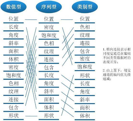
The above figure lists the commonly used visual coding channels in data visualization works. For the same data type, the subjective cognition brought by different visual channels is very different. Numerical types are suitable to be represented by visual channels that can be quantified, such as coordinates, lengths, etc. The effect of using colors is greatly reduced, and it is easy to cause ambiguity; similarly, sequence types are suitable for visual channels with obvious discrimination, and category types are suitable for use. Easy to group visual channels.
It should be pointed out that the concept contained in the above figure can cope with the design "routines" of visualization graphics in most application scenarios, but data visualization as the essence of visual design determines that "mountains are impermanent, water is impermanent", and any visualization effect Refusal to apply mechanically, not to mention that the application of data visualization is also affected by the business, the scene and the audience.
4. Color matching
I believe that every data analyst who is a code farmer will be confused about how to match colors when doing visual design. Color theory seems simple but tedious, but it is not so handy to use. So, how to make data visualization works simple, smart, and beautiful? Here are some general tips.
1) The span of hue and lightness must be large
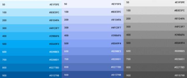
To ensure that the color matching is very easy to identify and distinguish, their brightness difference must be large enough. The difference in brightness needs to be considered globally. However, it is not enough to have a set of color schemes with a wide range of brightness. The more diverse the color schemes, the easier it is for users to associate data with images. If you can make good use of the color change, you can make it easier for users to accept it. For lightness and hue, the larger the span, the more data can be carried. The following figure shows the color scale contrast of different brightness in the same color system:
2) Color matching that imitates nature
Designers from all walks of life know this little secret, and for data visualization engineers, this trick is even more tried and tested. A simple and effective method is to find the picture you like, such as a beautiful landscape photo, use the "filter-mosaic-adjust the shape and size of the polygon" in photoshop to see the various colors contained in the picture, and then use the eyedropper The tool can select several colors:


3) Use gradient
Whether you need 2 colors or 10 colors, these colors can be extracted from the gradient to make the visual chart feel natural, while maintaining sufficient hue and brightness differences. A good way to use gradients is to pull the guide line to the breakpoint position in Photoshop, corresponding to the number of data, and then continue to test and adjust the gradient.
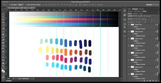
You can see that the color table is next to the gray gradient at the top, adjust the gradient overlay (you can get the precise gradient color value afterwards), and then select colors from those breakpoints to test the effect of color matching in actual use.
4) Use color matching tools
All kinds of free resources abound on the Internet. For those who want to design beautiful effects but have nothing to do, it is a good way to refer to the following tools:
ColorHunt-high-quality color scheme, can be quickly previewed, if you only need 4 colors, this is an excellent resource;
Kuler-Photoshop color matching tool, from Adobe, it should not be wrong;
Chroma.js-Chroma.js is a miniature JavaScript library, suitable for various color processing, can achieve various color conversion and color scale processing;
Color brewer-map color matching tool, if you are confused about map-based visual color matching schemes, this online tool should be able to help you.
In addition, there are some tips about color matching: follow the company’s established brand style; set according to the object described by the data, if the data describes coffee, you can consider using coffee color; use season or festival-related themes Color; if you really feel a headache about color matching, use the versatile "gray" and shades.
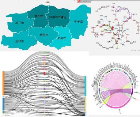
statistic chart
Statistical charts use the earliest visualization graphics. In the course of hundreds of years of evolution, a basic "routine" has gradually formed, which is in line with human perception and cognition, and thus is widely accepted.
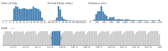
Commonly used in various analysis reports are histograms, line charts, pie charts, scatter charts, bubble charts, and radar charts. For these most commonly used chart types, the following table can show you the general direction:
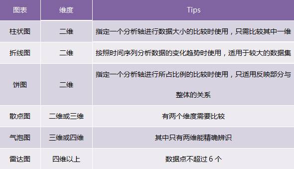
When we make visual charts, we must first start from the business, and give priority to selecting reasonable and consistent charts, especially if your user levels are diverse, please take into account the needs of users of all ages or different cognitive abilities ; Secondly, it is selected according to the various attributes of the data and the characteristics of the statistical chart. For example, the pie chart is not suitable for displaying absolute values, but only suitable for reflecting the proportion of each part. For commonly used charts, proceed with purpose and follow various constraints. I believe you can find suitable charts:
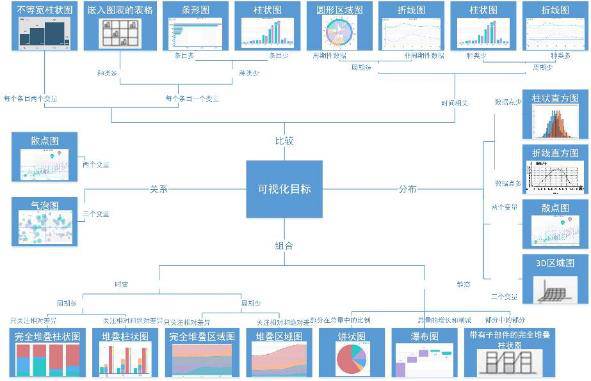
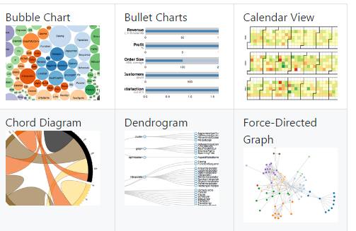
In addition to the commonly used charts, there are also:
Funnel chart: The funnel chart is suitable for process analysis with relatively standardized business processes, long cycles, and multiple links. Through the comparison of business data in each link of the funnel, the problem can be found and explained intuitively.
(Rectangular) tree diagram: an effective chart structure for visualizing the hierarchical structure, suitable for data sets representing similar file directory structures;
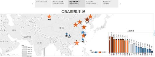
Heat map: displays the page area that visitors are keen on and the geographic area where the visitor is located in a special highlight form. It is based on GIS coordinates and is used to display the relative density of people or objects;
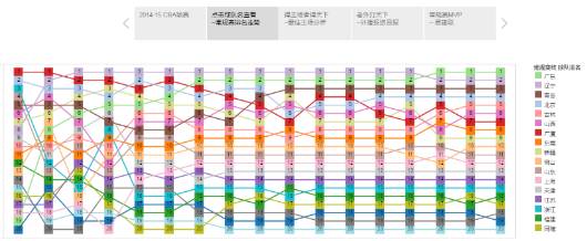
Relation diagram: based on the point-line combination in 3D space, plus the modification of dimensions such as color and thickness, which is suitable for characterizing the relationship between nodes;
Word cloud: a collection of various keywords. The size or color of the font often represents the frequency of the corresponding word;
Sankey chart: a chart represented by a set of curves with a certain width, suitable for showing the correlation between classification dimensions, and presenting the number of elements sharing the same category in the form of a stream, such as showing the distribution of the number of people in a specific group;
Calendar chart: As the name suggests, a chart that modifies cells with a calendar as the basic dimension.
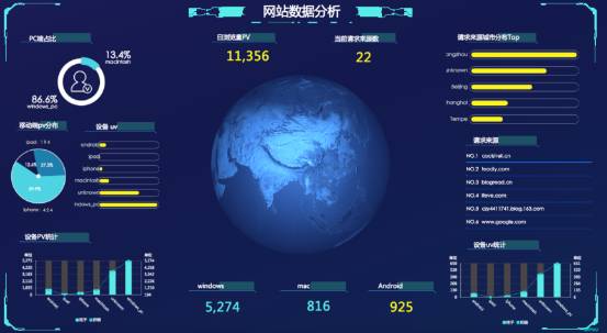
Data visualization tools
New types of data visualization products emerge in an endless stream. Basically, various languages ​​have their own visualization libraries. Traditional data analysis and BI software have also extended certain visualization functions. In addition, we have special finished software for visualization. The scope is too much. Then, the visualization tool we want to choose must meet the big data needs of the Internet explosion. It must quickly collect, filter, analyze, summarize, and display the information needed by decision makers, and update it in real time based on the newly added data.
Real-time: Data visualization tools must adapt to the explosive growth of data in the era of big data, and must quickly collect and analyze data and update data information in real time;
Simple operation: data visualization tools meet the characteristics of rapid development and easy operation, and can meet the changing characteristics of information in the Internet era;
Richer presentation: Data visualization tools need to have richer presentation methods that can fully meet the multi-dimensional requirements of data presentation;
Multiple data integration support methods: The source of data is not limited to the database; many data visualization tools support team collaboration data, data warehouse, text and other methods, and can be displayed through the Internet.
Data visualization is mainly realized through programming and non-programming tools. Mainstream programming tools include the following three types: data visualization created from an artistic point of view, a typical tool is Processing, which is a programming language for artists; from the perspective of statistics and data processing, it can be used for both data analysis and data processing. Do graphics processing, such as R and SAS; tools between the two must take into account both data processing and display effects. D3.js and Echarts are both very good choices. The two are Javascript-based data Visualization tools are more suitable for interactive display of data on the Internet.
1. Entry level
Entry-level means that the tool is a skill that visualization workers must master, and the difficulty is not necessarily small, and the threshold is not necessarily low. On the contrary, for visualization experts, these tools still play a magical effect.
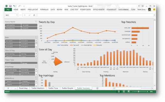
Excel
Don't think that EXCEL only processes tables. You can use it as a database, you can also use it as an IDE, or even use it as a data visualization tool. It can create professional pivot tables and basic statistical charts, but due to the default settings of colors, lines and styles, it is difficult to create visual effects that look "tall". Nevertheless, I still recommend that you use Excel.
Tableau
I believe that everyone who has come into contact with data visualization has heard of Tableau. It requires some structured data and you also need to understand some BI. It does not require programming, and the stunning effects can be completed by simple drag and drop operations. Compared with Excel, it is a weapon for professionally dealing with data visualization solutions, mainly in data visualization, focus/deep exploration, flexible analysis, interactive design and other functions. The biggest disadvantage of Tableau is that it is a commercial software, and there is only a 14-day free period for personal use, and the official price is high.
2. Online data visualization
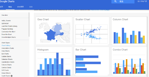
Google Charts
Google Charts is a free and open source js library that is very simple to use. Just point src to https:// in the script tag and start drawing. It supports HTML5/SVG, can be deployed across platforms, and uses vml for compatibility with older versions of IE.
Before the release of the new version of googlecharts, google had a similar product called Google Charts API, the difference is that the latter used http request to submit the parameters to the api, and then the interface returned a png image. If you open http://chart.googleapis.com/chart?cht=bvg&chs=250x150&chd=s:Monkeys&chxt=x,y&chxs=0,ff0000,12,0,lt|1,0000ff,10,1,lt, you can Show the following picture:

Flot
Flot is a great line graph and bar graph creation tool that can be used in all browsers that support canvas-meaning most mainstream browsers. This is a jQuery library. If you are already familiar with jQuery, you can easily perform callback, style and behavior operations on images. The advantage of floating is that you can access a large number of calling functions so that you can run your own code. Set a style to show different effects when the user hover, click, or remove the mouse. Compared with other drawing tools, floating gives you more flexibility. Floating does not provide many options, but it can perform common functions well.
D3
D3 (Data Driven Documents) is another JavaScript library that supports SVG rendering. However, D3 can provide a large number of complex chart styles other than linear graphs and bar graphs, such as Voronoi diagrams, tree diagrams, circular clusters, and word clouds. D3.js is the abbreviation of Data-Driven Documents. It uses HTML\CSS and SVG to render wonderful charts and analysis graphs. D3's emphasis on web standards is sufficient to satisfy the possibility of being used in all major browsers, freeing you from the trouble of being tied up by other types of architectures. It can combine components with great visual effects and data-driven methods.
Echarts
One of the excellent products produced by Baidu is also one of the few high-quality products in the current open source projects in China. A pure Javascript chart library that can run smoothly on PCs and mobile devices and is compatible with most current browsers. The bottom layer relies on the lightweight Canvas library ZRender, which provides intuitive, vivid, interactive, and highly personalized customization. Data visualization chart. In the 3.0 version, more rich interactive functions and more visualization effects have been added, and the mobile terminal has been deeply optimized. The most exciting thing about Echarts is its rich chart types and extremely low difficulty of getting started.

Highcharts
At the beginning of the emergence of Echarts, the functions were not so complete, and visualization workers often chose HighCharts. Highcharts series software includes Highcharts JS, Highstock JS, Highmaps JS, three softwares, all of which are HTML5 chart libraries written in pure JavaScript. Highcharts is a chart library written in pure JavaScript, which can easily and conveniently add interactive charts to web sites or web applications. Highstock is a stock chart control written in pure JavaScript, which can develop timeline charts of stock trends or large amounts of data. Highmaps is an excellent map component based on HTML5.
R
Strictly speaking, R is a data analysis language, juxtaposed with matlab and GNU Octave. However, the emergence of ggplot2 makes R successfully rank among the ranks of visualization tools. As a powerful mapping software package in R, ggplot2 has its own concept of data visualization. It separates data, data-related drawing, and data-independent drawing, and adopts layered development logic, and is not restricted to rules, and various graphic elements can be freely combined. When you are familiar with the basic routines of ggplot2, data visualization will become very easy and organized.
DataV
The data visualization solution produced by Alibaba recommends DataV, a rising star, entirely because the real-time interactive large screen during Taobao's double "11" event is too eye-catching. DataV supports a variety of data sources, especially the perfect connection with the various databases of Alibaba. If your data itself exists on Alibaba Cloud, then choosing DataV is definitely a good way to save time and effort. In terms of charts, DataV has built-in rich chart templates to support real-time data collection and analysis.
3. GUI-like data visualization
Crossfilter
Crossfilter is a JavaScript library used to display large data sets. It can combine data visualization and GUI controls. Buttons, drop-downs, and sliders evolve into more complex interface elements, allowing you to expand content while changing input parameters and data. The interaction speed is super fast, even with millions or more of data. Crossfilter is also a JavaScript library. It can create filters for data without affecting the speed, use the filtered data for display, and involve limited dimensions, so it can complete the screening and loading of massive data sets.
4. Advanced Tools
Processing
Processing is written in the Java programming language, and the Java language is the closest to Processing in the language tree. So, if you are familiar with C or Java language, Processing will be easy to learn. Processing does not include some of the more advanced features of the Java language, but many of these features have been integrated into Processing. Today, a dedicated community (https://) has been formed around it, dedicated to building various libraries for animation, visualization, network programming and many other applications in this language and environment.
Processing is a great environment for data visualization, with a simple interface, a powerful language, and a rich set of mechanisms for data and application export.

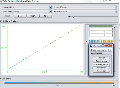
Weka
Weka is an excellent tool that can classify and cluster large amounts of data based on attributes. Weka is not only a powerful tool for data analysis, but it can also generate some simple charts. First of all, weka is a powerful tool for data mining. It can quickly import our structured data, and then classify and cluster the data attributes to help us understand the data. But his visualization function is also not inferior. Choose visualization in the interface, and you will immediately understand: it allows you to understand the data, and then you let the user visualize the data.
Concluding remarks
The era we live in is an era of great knowledge explosion. As far as programming is concerned, almost everyone can write one or two lines now, and the group of programmers has expanded in more dimensions than it did ten years ago. The threshold for the use of various tools is getting lower and lower, which brings about the gradual elimination of industry barriers. Using some kind of visualization method is not the only criterion for distinguishing Xiaobai from experts. I have heard that some people use artifacts such as Unity and Yi Language to achieve visualization. Therefore, the dazzling tools are always only auxiliary. What really determines how far you go on the road of visualization is your accurate grasp of the visualization concept and persistence.
ZGAR Disposable Vape
ZGAR electronic cigarette uses high-tech R&D, food grade disposable pod device and high-quality raw material. All package designs are Original IP. Our designer team is from Hong Kong. We have very high requirements for product quality, flavors taste and packaging design. The E-liquid is imported, materials are food grade, and assembly plant is medical-grade dust-free workshops.
Our products include disposable e-cigarettes, rechargeable e-cigarettes, rechargreable disposable vape pen, and various of flavors of cigarette cartridges. From 600puffs to 5000puffs, ZGAR bar Disposable offer high-tech R&D, E-cigarette improves battery capacity, We offer various of flavors and support customization. And printing designs can be customized. We have our own professional team and competitive quotations for any OEM or ODM works.
We supply OEM rechargeable disposable vape pen,OEM disposable electronic cigarette,ODM disposable vape pen,ODM disposable electronic cigarette,OEM/ODM vape pen e-cigarette,OEM/ODM atomizer device.


ZGAR Disposable Vape,ZGAR Disposable Vape disposable electronic cigarette,ZGAR Disposable Vape pen atomizer ,ZGAR Disposable Vape E-cig,disposable electronic cigarette
ZGAR INTERNATIONAL(HK)CO., LIMITED , https://www.szvape-pods.com